Is Your B2B Website Truly User-Friendly?
While websites aimed directly at consumers are getting faster, sleeker and more organized than ever before, some B2B website designs are lagging behind.
In fact, we regularly come across sites for popular products and services that are poorly laid out and difficult to use.
One could argue that this shouldn’t matter if the businesses behind these websites are doing well.
In other words, if sales and marketing had been affected too badly, the companies in question would have made improvements long ago.
So, there shouldn’t be any problem, right?
The answer, for those of us B2B web design agencies, is that it’s hard to measure the leads and sales you don’t get because of bad web design.
In other words, these businesses could be doing a much better job promoting their own products and services if they paid more attention to design, and especially user experience (or UX).
Bad UX makes it difficult to understand your website and access relevant content. It can also hurt SEO. It puts a stumbling block between your prospects and what it is you want them to purchase.
Underwhelming UX can manifest as bad design, hurting your credibility. Poor navigation compounds the issue, making movement between site areas difficult.
Technical problems, such as slow loading times, mobile incompatibility, or on-screen errors, further exacerbate the user experience.
Let’s take a look at some of the underlying causes of bad B2B website design, some B2B website best practices, and tips you can use to measure your progress.
Why B2B Web Designs Can Be Hard to Use
Why is it that as website designs are getting better and better, there are still so many B2B companies falling behind the curve?
With the products and services being offered representing a substantial investment of time and money, shouldn’t B2B marketers be pulling out all the stops to present themselves as professionally as possible?
You would think so, but there are many factors working against improvement in this area. Most of them stem from the complexity of the solutions themselves.
B2B website strategy looks a little different than one’s typical website.
The average B2B website is going to be larger than one designed to promote products and services to the public.
B2B products have to appeal to multiple levels and decision-makers within an organization, and may involve changes at the regulatory or institutional level.
Simply put, there are a lot of moving parts, from content to apps, that need to be changed when a B2B web design is updated.
For that reason, some organizations put off improvements to their website even though they may sorely be needed.
It’s always easier to stick with what you have than it is to take on a big project, particularly when (as we’ve already described) the company might not be feeling the pinch on their bottom line yet.
Another key factor lies in the reality that many B2B website users aren’t decision-makers.
To put this another way, the people approving purchases aren’t the ones inconvenienced by the underwhelming web design. So, the individuals most likely to suffer from bad UX either can’t or won’t speak up.
These factors make it easy to sweep a potential B2B website redesign under the rug, but that doesn’t mean they don’t affect a business.
In fact, it makes the issues all the more important to identify and correct, since you aren’t likely to hear about them until it’s already too late.
How to Improve Your B2B Website From a UX Standpoint
No matter how big or complex your B2B solution is, your website should be designed for actual humans. Just recognizing that and adopting that point of view is a big first step in the right direction.
Your next task, if you want to improve the user-friendliness of your website, is to think about the people who come to your site. What it is they need to get done when they arrive on your pages?
Identify a few key tasks that might need to be completed, and then look for ways to streamline the movement from one step to another.
It’s important to pause for a moment and remember that B2B websites differ from others in that visitors are almost always arriving with specific goals in mind.
You might spend time browsing on Amazon or waste 15 minutes on Facebook, but you aren’t looking up SaaS accounting software because it seems like a fun way to kill an afternoon.
The men and women who make their way to your pages might:
- need product and pricing information
- have customer service concerns
- or want to see your latest white paper so they can address an internal question over safety or government regulations.
The more barriers they encounter between their arrival and the need they have to fill, the less likely they are to continue their search or do business with you.
For that reason, streamlined design and navigation are at the heart of good UX, particularly for B2B marketers. (Shameless plug for our beautiful website.)

Benchmarking UX on Your Pages
Being aware of good UX principles is one thing, but actually measuring the user-friendliness of your B2B website is another.
It would be very difficult to accurately score your pages based on customer satisfaction, but luckily you can do even better by monitoring visitor behavior.
When you can see how potential customers and clients are interacting with your site, you can draw clear conclusions about what is and isn’t working with your layout.
The process we are referring to is called benchmarking, and it just means taking defined measurements at specific time intervals.
What kinds of measurements do you need to study on your website? Let’s look at a few that we follow very closely for our clients:
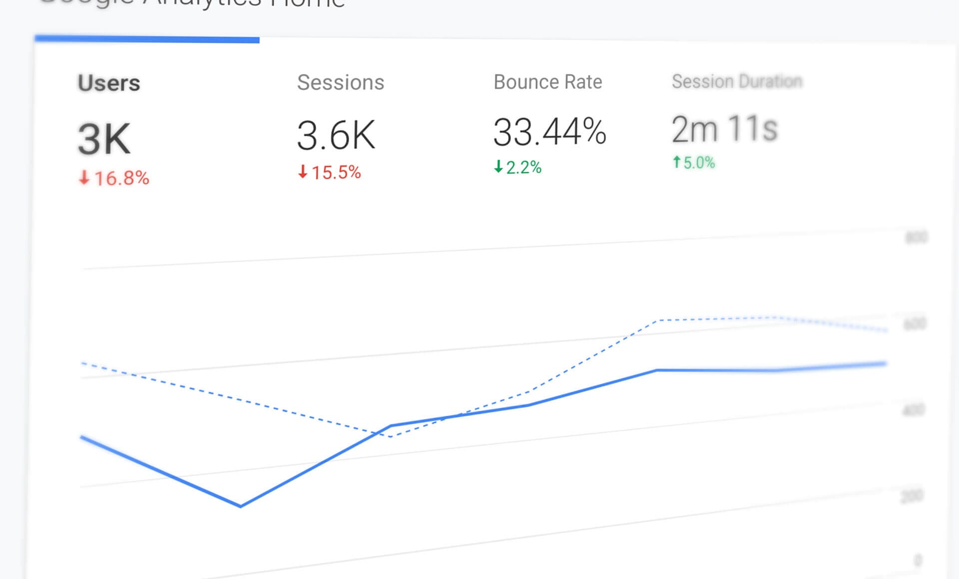
Channels
Also known as traffic sources or traffic acquisition, these tell you whether you’re getting visits from organic search, direct traffic (someone typing your URL into a browser), referrals from other sites, social media campaigns, email newsletters, or other sources like paid ads.
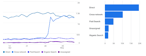
Naturally, this information can be helpful for improving your sales funnel, but it also gives you insights into what your prospects are looking for when they arrive at your pages.
Page Traffic
By studying your B2B website’s traffic on each of your pages, you can quickly deduce which topics, business areas, or pieces of content are most important to your target audience.
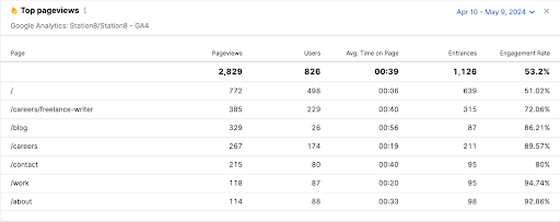
Often, these statistics will confirm your suspicions about the popularity of various products or services, but you may occasionally be surprised.
Time on Page
Generally speaking, having visitors spend a lot of time on a particular page can indicate its popularity and importance. However, you have to keep a close eye on overall activity to ensure that you aren’t seeing signs of confusion or frustration among your prospects.
Average Session Duration
When potential buyers take a lot of time on your website, it’s an almost surefire sign that your pages have good UX.
Conversely, when you struggle to keep buyers engaged with your content, that may be a clear signal that they are frustrated or underwhelmed with various aspects of your B2B website and often leave before finding the right answers or solutions.
Landing and Departing Pages
It’s a good idea to keep track of which pages on your website are drawing the most incoming traffic, as well as the ones resulting in the highest number of exits.
Not only will this tell you a great deal about the flow of visits through your site, but it can be extraordinarily helpful when you’re looking to identify bottlenecks and underperforming calls to action.
Bounce Rate
A “bounce” on your website occurs when someone arrives and then leaves without taking any further action.
Occasionally, this can mean they found what they were looking for right away, but usually it’s a sign of poor UX.
A high bounce rate equals a slew of missed opportunities to win new customers in your B2B website, so track this metric closely.
Studied together, these kinds of statistics tell a story about your website’s usability.
They give you some insights into:
- where searchers and prospects are coming from when they arrive on your pages
- which pieces of content they pay attention to
- and how they spend their time.
They also tell you where stopping points and bottlenecks arise, and if there are parts of your website where visitors are getting stuck.
When you look between the lines of these figures, you can discover which elements of your website are most important and usable, and which areas could be refined or improved.
The beauty of benchmarking is that it moves beyond static observations. You can compare your B2B website metrics to historical performance, industry averages, or even your perceived competition.
Most importantly, you can set standards for good B2B UX on your website and keep looking for ways to improve upon what you find.
Finding the Value in Better B2B Website Design Principles
It’s possible for a B2B firm to get away with having an underwhelming website with bad UX. But, there’s a big difference between saying that losses are unnoticed and that they don’t exist.
We would argue that having business slip away because your website is poorly organized is even worse than missing out on a customized sales proposal.
That’s because the online opportunity disappeared before you could even identify it or get a chance to make your case.
When you focus on building a user-friendly B2B website and then benchmark the results, you get past the kinds of assumptions and excuses that can easily stop you from winning new customers and clients.
And, you give yourself a template to provide your buyers with the information and answers they want when they are looking for solutions online.
Marketers understand they need to stack as many factors in their favor as possible, and realize that good UX and design affect not only credibility but also bottom-line results.
There are plenty of competitors and obstacles to making a sale out there. The last thing you need is for your website to be another one of them.
Station8 is a B2B website design agency located in Tulsa, Okla. They have a history of working with clients that have incredible noble causes™.
Station8 also offers award-winning messaging, advertising, digital marketing and SEO strategies.
Published: November 4, 2019