Logo redesign or refresh? Here are five logo projects that cover both.
You’re at that pivotal part in the rebranding process where you have to decide — do you want a logo redesign or refresh? It’s important to consider the effects of each and how they impact your company.
Even more than slogans and other branding elements, your brand’s logo should have longevity.
Still, after years or even decades of faithful service, logos sometimes require updating to accurately reflect the brand’s current image.
For established companies and products with valuable brand equity, the question arises: do we do a complete logo redesign or a logo refresh?
Below are some examples of logo projects designed by Station8. They demonstrate both ends of the spectrum and the strategic thinking behind each approach.
Petroplex Acidizing Inc - logo redesign
In addition to a brand new website and photoshoot, Petroplex wanted a logo to propel them forward in the new era of their business. Their former logo was hard to read and lacked structure.
![]()
Station8’s logo redesign brought a striking and stylish wordmark to the acidizing company. The italicized serif fonts in addition to the hidden arrow symbolize the constant pursuit of progress within the company.
![]()
Flintco - logo refresh
A cumbersome font hurt Flintco’s legibility and didn’t reflect the construction company’s innovation-driven approach. But, they didn’t want to stray too far from what they had before. This is where a logo refresh can come in handy.
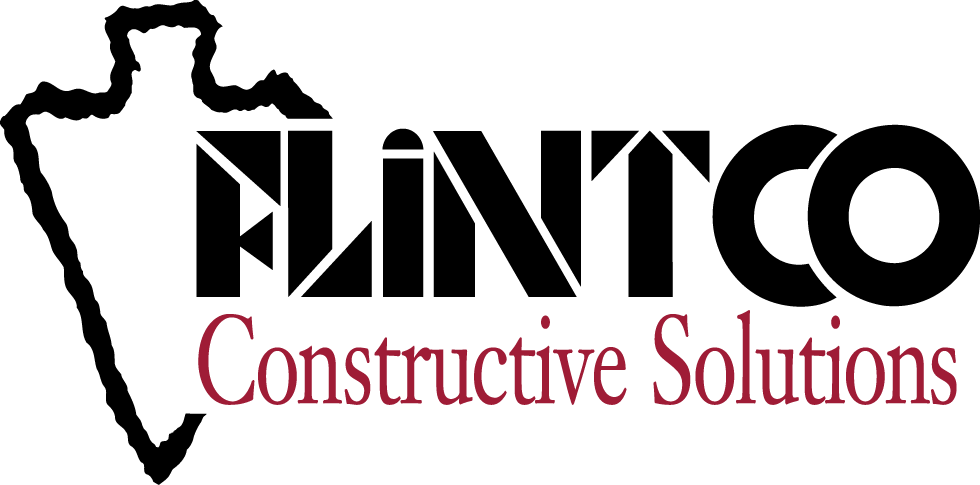
The new design capitalizes on the company’s recognizable arrowhead while honoring its heritage. Solid and bold, the modern serif font features a stylized reference to a crane in the first letter.
![]()
TEAM - logo refresh
Between the emphasis on the acronym, a four-colored star and a small subhead, TEAM’s logo had a lot going on.
![]()
This new logo refresh simplifies and declutters the original logo while maintaining the integrity of the former. A forward-thinking gradient replaces the previous multi-colored shape and the addition of a yellow star adds in a new storytelling element. This now allows TEAM to highlight being that reliable guiding star for their clients.
![]()
Coastal Endodontics - logo refresh
The Coastal Endodontics logo hadn’t been updated for quite awhile, but they loved the character that the wordmark had. They had an emotional connection to the logo and didn’t want to see it completely go away.
![]() Station8’s solution was a logo refresh that reformulated the proportions of each element, introduced a sleek typeface and added in a complimentary second color.
Station8’s solution was a logo refresh that reformulated the proportions of each element, introduced a sleek typeface and added in a complimentary second color.
![]()
AdjusterPro - logo redesign
AdjusterPro is the nation’s leading online training and licensing provider for insurance claims adjusters. Their old logo features an elliptical element so common to the 90s that it dates the design and fails to differentiate them in the marketplace.
![]()
A strong new mark, font and brand colors now align with this company’s leading edge online education.

Logo redesign vs logo refresh
Knowing the difference between a logo redesign and logo refresh is paramount when navigating the rebrand process for your company.
The examples above show the purpose and importance of each.
Logo projects are fun! A logo redesign or a logo refresh both give your team the opportunity to showcase who you are now and spread your wings creatively. Whether it’s time to say goodbye to an old logo or just give it a modern facelift, we’d love to partner with you and help fire up your brand.
Station8 is a marketing agency located in Tulsa, Okla. They have a history of working with clients that have incredible noble causes™.
Station8’s award-winning services include messaging, advertising, digital marketing and SEO strategies.
Published: August 2, 2018