Bradford Minerals: Building an SEO-friendly website from the ground up
We worked with Bradford Minerals to create an SEO-friendly website that captures the guts and grit of the Oklahoma-based business.
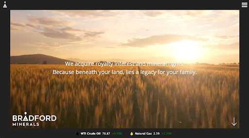
As a family-owned business, Bradford acquires royalty interest and mineral rights on behalf of individuals, mainly in the Delaware Basin of West Texas and southern New Mexico.
Let’s take a look at how we developed this to be an SEO-friendly website.
Digital agency standards and client expectations
We attempt to best align the client’s needs with our digital standards.
As an SEO-focused digital marketing firm, that means championing:
- user experience
- page-speed
- SEO- friendly development
- responsive design
- security
For this website, we chose WordPress as our platform. About half the sites we build use WordPress because it is flexible, allows us to stick to our standards and enables big-picture thinking.
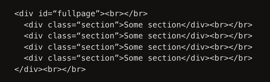
Compatibility and responsiveness through fullPage.js
At the beginning of a website project, our UX/UI and web development professionals take charge by determining a suitable website structure based on the many facets of the job.
We decided Bradford’s design necessitated a vertical scrolling structure throughout the site. To bring this function to fruition, we employed fullPage.js because of its compatibility and responsiveness.
Per their GitHub page, here’s what fullPage.js is all about:
“A simple and easy-to-use library to create fullscreen scrolling websites (also known as single page websites or one-page sites). It allows the creation of fullscreen scrolling websites, as well as adding some landscape sliders inside the sections of the site.”
fullPage.js is fully functional on all modern browsers, as well as other more antiquated browsers.
Furthermore, it works with browsers supported by CSS3 and those not, making it almost universally compatible. In addition, it provides touch support for mobile phones, tablets and touchscreen computers.
fullPage.js is so outstanding and developer-friendly, that our team has created other scrolling sites using the same library.
In addition to the scrolling feature, fullPage.js enables us to achieve eye-popping transitions. To create these transitions, the fullPage.js library requires a very basic HTML structure at the start.
The real power kicks in when the HTML structure is initialized via JQuery.
This allows us to effortlessly manage settings to customize the look and feel of each fullPage.js section.
An abundance of opportunities exist including:
- setting a scrolling speed between sections to enable keyboard scrolling
- adding supplementary class names to sections to creating navigation buttons
- setting fixed elements that appear on all sections (such as header and footer) to lazy-loading images and creating parallax sections.
And you can get even more meticulous if you want.
With Bradford, we stylized subtle details by creating custom functions with fullPage.js’ “call backs.”
Custom functions allowed us to add different class names to various elements, and to pause or play videos depending on the section in the viewpoint.
Importance of UX in SEO-friendly websites
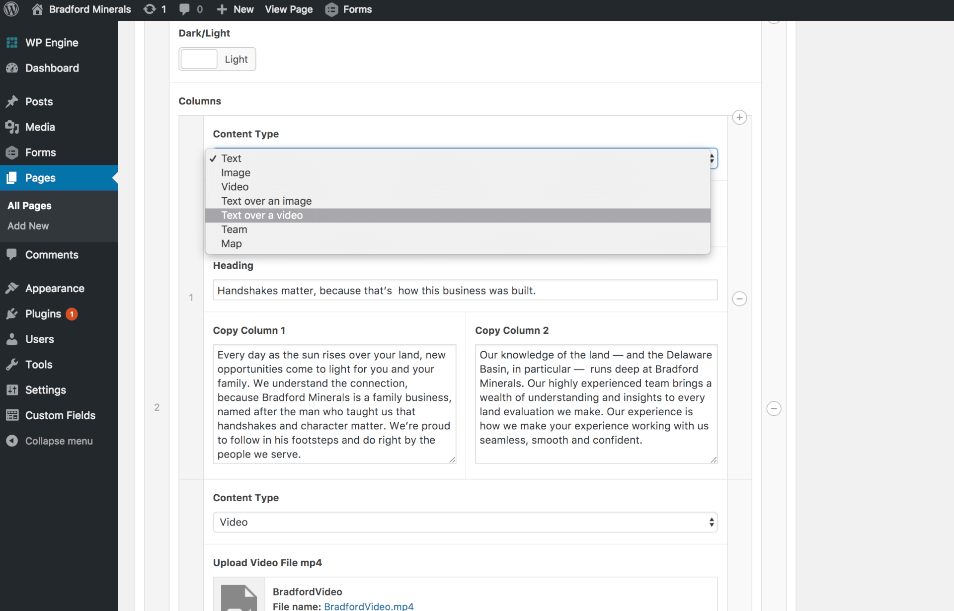
For Bradford, WordPress was instrumental in creating a positive frontend and backend user experience alike.
On the backend, we integrated Advanced Custom Fields (ACFs) into WordPress to facilitate maintenance and updates through an easy-to-use interface. This powerful tool gives editors a ton of options.
For each fullPage.js section, ACFs allow backend users to:
- change content type
- update copy
- swap out images and videos
- adjust the “Dark/Light” with a toggle feature
It’s flexible, scalable and easily operated. That’s why we like it — and our backend users do, too.
A myriad of opportunities with SVGs
At Station8, advertising and branding are part of our core strengths. For Bradford, our talented team designed a logo we believe honors the company’s connection to people and land.
On the website, this logo, along with a menu icon and other icons, are incorporated and formatted as SVGs (Scalable Vector Graphics), an XML-based vector image.
SVGs are powerful digital weapons because of their responsivity, speed and editability. They are supported on all major browsers, and Google even indexes them, which is great for your Search Engine Optimization (SEO) strategy.
In addition, SVGs are valuable assets because they pack a small file size, load fast and look great on every screen resolution.
There is a myriad of ways SVGs can be used.
Currently, they are used by only 56.4% of all websites. Google, Reddit, Dropbox and ESPN are among these sites.
At Station8, we build all of our websites with SVGs. For Bradford, we utilized them as images, since CSS and Javascript manipulation and animation were not required.
At this time, WordPress core doesn’t support SVGs; we worked around this issue by using the SVG Support plugin. This plugin allows the developer to embed an SVG file’s code using the HTML <img />tag by simply adding the class name“style-svg” to it.
We won’t delve into details about how to use SVGs today, but if you’d like to learn more, you can check out Ryan Irelan’s great SVG primer and Jake Giltsoff’s informational guide.
What’s slowing down your website?
Everyone wants a fast-loading website. Everyone.
On the Bradford homepage, we poured everything we had into creating a stunning visual experience. We accomplished this by including three eye-catching videos.
These videos add texture and a powerful aesthetic to the overall design. They also presented challenges with performance and page speed.
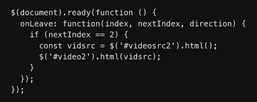
It may appear easy to delay video loading if you simply add <preload=”none”>to your video tag. But what if you need to autoplay the video when it’s on the screen?
Since the preload attribute conflicts with the autoplay attribute, both cannot be used. As a remedy, we utilized jQuery by creating an empty html5 video tag and adding a div to the source code. So it looks like this:
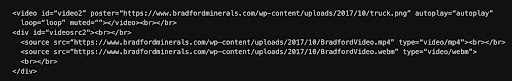
Browsers won’t recognize <source>tags unless they’re in the <video>tag; the <video>tag won’t work until it includes a <source>tag.
Your browser can’t render anything until it’s connected with a fullPage.js event and jQuery is used to place the <source>tags into the <video>tag.
With our three videos, a whopping 7mb size page was dragging us down. But by successfully delaying the loading of the 2nd and 3rd videos, we counter-measured the bulky size, and voilà!
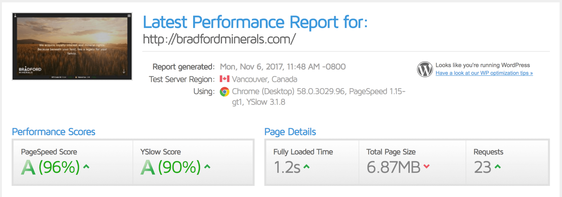
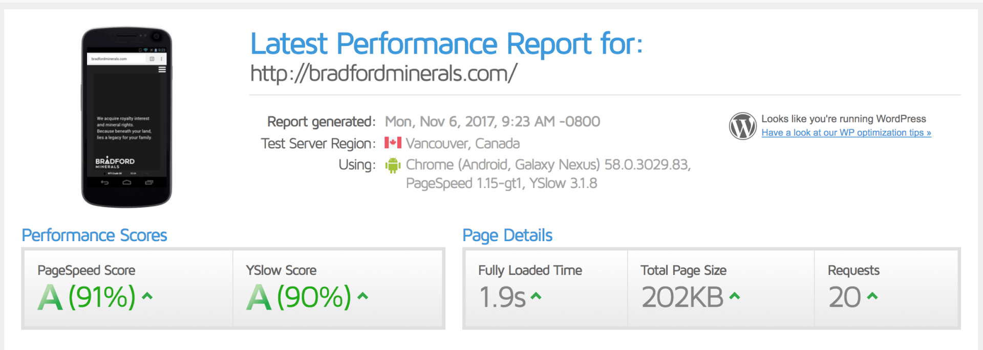
Of course, there are other factors to consider when it comes to page speed. Hosting, for one.
That’s where WP Engine comes in to facilitate caching, which is a highly effective way to optimize your WordPress site.
If you wish to tackle page speed head-on, you can also use a caching plugin.
At Station8, we like WPFastest Cache, a plugin designed to decrease website load times by minimizing and combining:
- CSS
- JS files
- browser caching
- gzip compression
Importantly, WPFastest Cache pairs well with WPEngine’s own caching system, unlike other popular caching plugins.
With all of our websites, we prioritize page speed. If you’re up for it, you can even put them to the test here.
Indeed, a discussion about page speed necessitates a deeper conversation about SEO.
It’s been demonstrated that page speed is a factor in Google’s algorithm to rank pages. That makes sense since it improves the user experience.
To optimize our SEO-friendly website, we referenced every trick in the book to decrease loading times.
SEO-friendly website development
Beyond page speed, website developers face additional SEO-related hurdles. Responsive development was one of these obstacles.
For the Bradford website, our biggest challenge was keeping the fullPage.js scroll structure on the mobile site. It’s a heck of a lot of content to fit.
However, through a series of responsive font size adjustments, we successfully combated this problem with responsive web typography. To learn more, check out this great tutorial about the best practices for responsive web typography.
In addition to page speed and responsivity, we also ensured a secure connection with an HTTPS — protection for users when they share personal information via website submission forms.
This secure connection is also highly valued by Google. A recent study found most of the domains with an HTTPS version outrank those without one.
We strive to build beautiful, whitehat SEO-friendly websites.
When you take a step back and look at the challenges we faced in development — structure, reduced loading time, responsive design — it’s easy to find that they are all connected to best SEO practices.
And if you look a little closer, all of these relate to user experience:
- good structure facilitates website discovery
- faster loading times mean less waiting to access information visitors want
- responsive design allows users to access info on the go
If that tells you one thing, it’s further evidence that SEO is inextricably linked to satisfying user needs. And that aligns perfectly with Station8’s digital standards.
Station8 is a marketing agency located in Tulsa, Okla. They have a history of working with clients that have incredible noble causes™.
Station8’s award-winning services include messaging, advertising, digital marketing and SEO strategies.
Published: August 2, 2018