Why A Full-Service Contractor Needed a Full-Service Ad Agency to Create a Captivating Website Design Experience
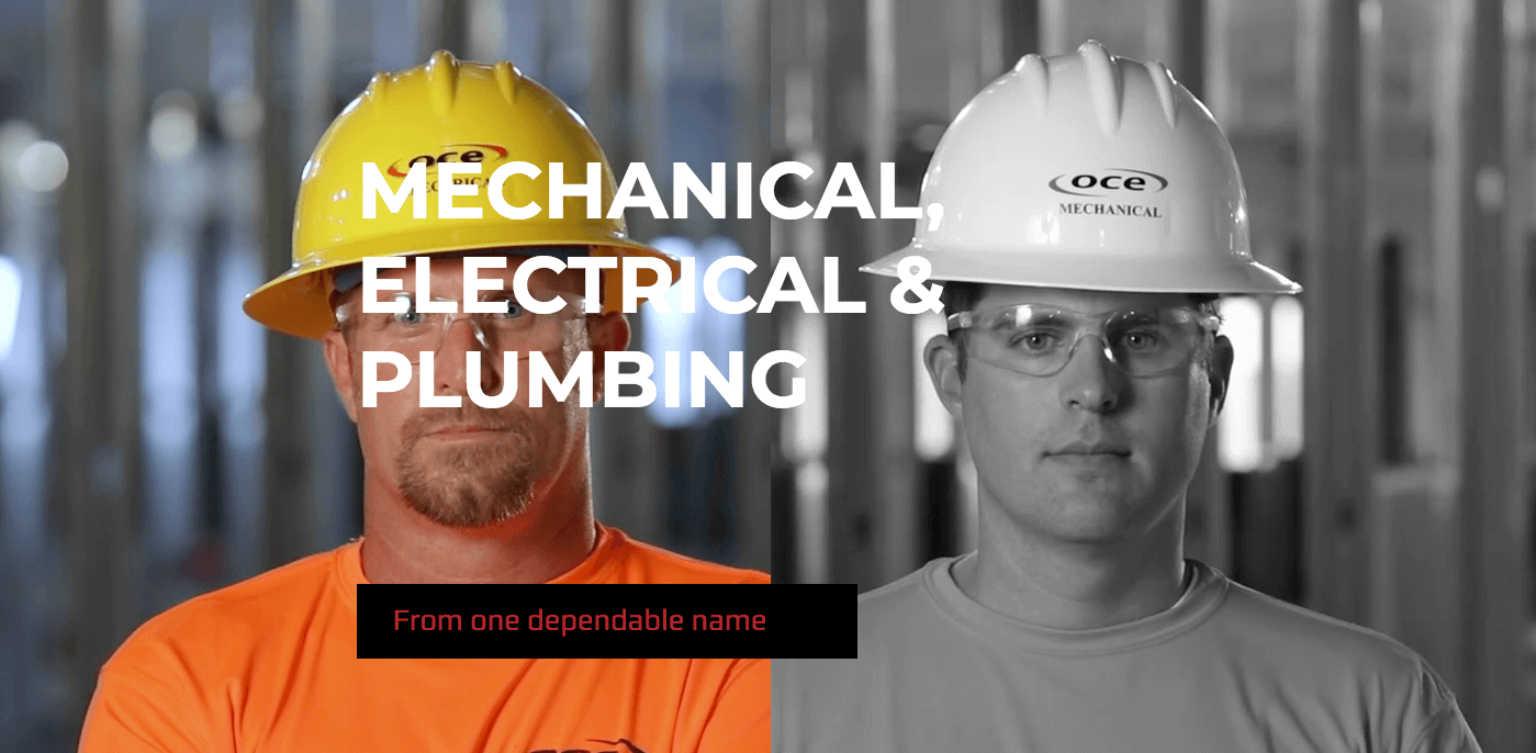
Oil Capital Electric (OCE) is known for delivering exceptional mechanical, electrical, and plumbing solutions from one dependable name. If you’re in the northeastern Oklahoma area, you’re probably familiar with their work — but you’re probably not familiar with their earned reputation for design-build teams in the region. Whether it’s in aviation, commercial, healthcare or hospitality, OCE brings exceptional quality and craftsmanship to every mechanical, electrical and plumbing project.
So when the full-service contractor needed a full-service advertising agency in Tulsa, they tapped Station8’s team to design, develop and launch a new website. Station8 was tasked with finding an effective way to reflect quality craftsmanship and clearly make the electrical and mechanical services distinct — all while honoring the OCE name. We carried this project across the goal line of success by creating an alluring homepage experience, optimizing the user journey through clear messaging, and by shining a light on The OCE Way. Here’s a closer look.
A Welcomed Web Design and Homepage Layout
Welcoming users with fast loading time, clear brand messaging and a well-marked start to the journey is critical to any company website. With the OCE site, visitors are met with two choices when they arrive on the homepage: visit a page about the electrical side of OCE’s business or learn more about mechanical. (An interesting side note: the color of the OCE hard hats on the homepage represents a worker’s division: yellow for electrical and white for mechanical. So when you see the group of them and you see both color hats in the photo, you know OCE is doing the whole project.) Hover your cursor over the left electrical side and the black-and-white OCE worker comes to life with color and movement; move it to the right and the black-and-white mechanical worker does the same.
Why the stark contrast, changes in color and movement? When it comes to website design and user experience, visitors want to find the information they’re looking for with the least amount of friction possible. By making their journey path simple, intuitive and easy-to-navigate with visual cues such as color changes or movement, we can more effectively lead users to the information they’re looking for. In fact, we designed the homepage with the specific intent to keep users discovering more before making contact, which is directly correlated to search engine optimization (SEO) rankings. In addition, as visitors scroll past the men in the yellow and white hats, a sticky navigation bar remains at the top of the browser window to always allow users to choose electrical or mechanical. At the bottom of the homepage, visitors are called to action to start a project, or they can easily make contact via the main menu.
OCE Sitemap: Quality User Experience and Website Design Leads Visitors to the Information They’re Looking For
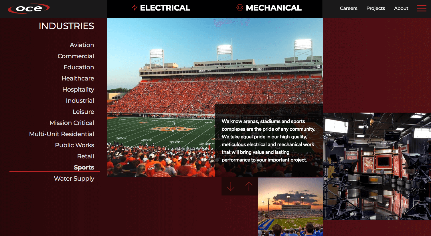
Designing a sitemap is no easy task. Just ask a UX designer. Yet it is one of the most important foundational initiatives that must be carried out when it comes to website design and digital strategy. In the sitemap phase of our website design and development process, we set out to create an intuitive menu for the new OCE website. Our design team created a successful user experience by not only delineating between mechanical and electric on the home page as described above, but also in the navigation menu. This is just one more easy way for visitors to understand and discover more information about OCE’s services.
In the Electric page, users discover preconstruction, design assist and design-build sections, as well as service and maintenance information, while the mechanical page provides a similar visitor experience along with a section focused on OCE’s quality craftsmanship. Both pages ultimately lead users to a form where visitors are only required to submit their name and email to connect.
Projects, About and Careers Pages for OCE’s New Website
Our website design and the customer’s journey continues with the Projects page. Here, visitors can see and read about the true craftsmanship that goes into the OCE’s process. Whether it’s aviation, commercial, public works or retail industry projects, visitors can discover projects relevant to their industry or sector. In addition, an About page spotlights The OCE Way, safety, awards and of course a call to action.
Conclusion
A final note on the brand messaging: Throughout the website, we sought to stress that these mechanical, electrical and plumbing services are not only from one name, but that they’re done a certain way — The OCE way. That means providing safe work environments. It means offering superior craftsmanship. It means detailed thinking to avoid delays and finish projects on time and under budget. You’ll see all of this and more reflected when you discover OCE’s new digital experience at oilcapitalelectric.com.
Last Modified: December 10, 2018